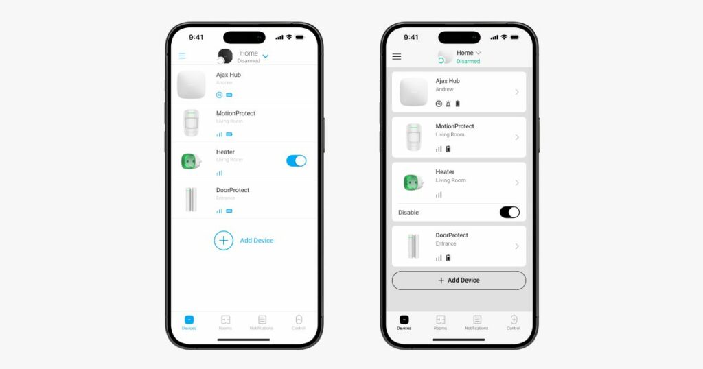
So that, regardless of the eye conditions, every user could easily and quickly see the necessary information, the application has increased contrast and extra icons for clearer navigation. Fonts and details became more contrasty in pretty much every corner.
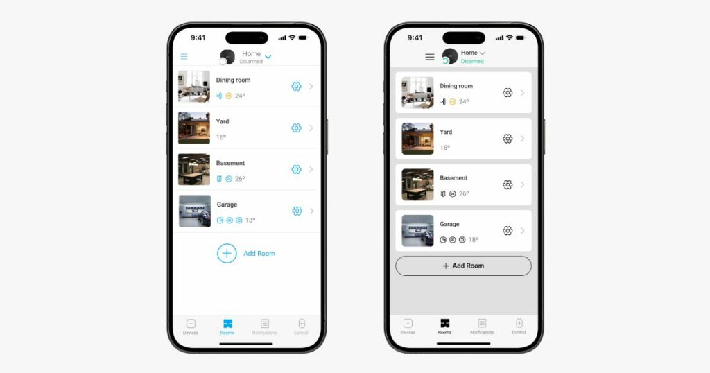
To ensure that users see conveniently summarized and grouped information, the same approach is applied in the Rooms menu.
Thanks to the clear color coding, the information is easy to read, and the updated text icons leave no doubt about the meanings.